Challenge 3 is over and even thought a lot less people voted this time, it looks like Jeff eeked out another win!
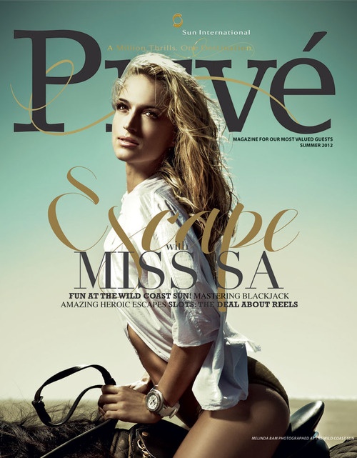
This week…err, last few days… our new challenge will be to design a magazine cover! And what better name to call the magazine than Brouye!
Magazines have always had a special place in my heart because of their ability to combine wicked creativity with a strict, structured text aspect. My childhood was lined with various magazine subscriptions like Wizard, Highlights, ESPN, SLAM, GQ, Men’s Health. As the years progressed, the magazine creativity kept upping the ante! Article titles were done by respected artists and covers were filled with beautiful typography that could easily double as a wall poster. Even the advent of infographics and hand drawn guides make everything look a little more appealing.
Until recently, I had no idea how a magazine was made. I mean, I had a general idea that you have main stories and then fill out the content around them but that’s about all I could determine. Last week, I saw this awesome video that really gave me a quick summary/look at how a whole monthly magazine issue is created.
Its so awesome to see how they map the entire layout on indesign and kind of assign pages to each writer and artist.
For our challenge, we are definitely NOT doing an entire magazine (although, maybe one day.. and digital, not printed) but rather just a kick-ass magazine cover! I think we discussed that the main front image didn’t have to be anything in particular but both agreed that when it comes to magazine covers, sex sells.
So lets get to it! Vote on the winner next Monday morning.

